





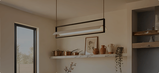





How Designers Balance Color and Lighting in Modern Homes

How Designers Balance Color and Lighting in Modern Homes
Modern homes today are no longer defined by minimalism alone. They are expressive, layered, and deeply personal — and the way color meets light is what makes them feel finished.
Designers balance color and lighting by choosing paint and fixtures together, not one after the other. Warm light suits earthy, neutral and bold palettes, while crisper light suits greys, blues and sleek finishes. They layer ambient, task and accent lighting, test paint swatches under the planned light, and use materials like glass, fabric and brass to soften or sharpen how color reads.
Walk into a well-designed contemporary interior and you will immediately sense something subtle yet powerful at work — a harmony between color and illumination that feels effortless but is carefully crafted.
Designers understand that color without proper lighting can feel flat, while lighting without thoughtful color can feel cold or disconnected. The true magic lies in how these two elements interact throughout the day, responding to natural light, artificial fixtures, textures, and finishes. In modern homes, lighting does far more than brighten a room — it shapes mood, highlights architectural details, and gives color its depth and character.
In this article, we explore how professional designers thoughtfully combine hues and lighting choices to create modern interiors that feel warm, stylish, and timeless. Drawing inspiration from contemporary living rooms, kitchens, dining spaces, bedrooms, and corridors, we break down the principles that define successful modern design — and show you how to apply them in your own home.
Why Should Color and Lighting Be Planned Together?
Every paint shade has hidden undertones — a little red, yellow, blue or green — and the light in a room decides which of those undertones you actually see. A greige that looks soft and warm in a sunny showroom can turn grey and lifeless under a cool ceiling light at night.
Planning both at the same time saves you from repainting, returning fixtures, or living with a room that never quite feels right. It is also the easiest way to make a modern home feel calm in the day and cosy after sunset.
The Four Principles Designers Follow
Before choosing a single paint chip or fixture, most interior designers work from these four simple rules.
Light Comes First
Decide the room's light color and brightness before finalising the paint shade.
One Tone per Room
Keep every bulb in a room the same color temperature so walls look even.
Layer, Don't Flood
Use three or more light sources at different heights instead of one bright fixture.
Test in Real Light
Check paint swatches in the room at morning, noon and night before committing.
How Do Color and Light Affect Each Other?
Understanding the emotional impact of color and statement lighting is the foundation of good design. Colors influence how we feel, while lighting controls how those colors are perceived.
Warm colors like terracotta and muted yellows create intimacy, while cool tones offer clarity. However, lighting determines whether these colors feel inviting or sterile. Here is what designers watch for:
- Warm lighting enhances earthy and neutral tones — beige, sand, ochre and terracotta look richer and more welcoming.
- Cool lighting highlights modern finishes — chrome, marble, white lacquer and concrete look crisp and clean.
- Brightness changes saturation — strong light makes colors look lighter and flatter, while dim light makes them deeper and moodier.
- Shadows add depth — a single overhead light flattens even a beautiful color; light from several angles gives walls dimension.
- Paint sheen matters — glossy walls reflect light and show glare, while matte and eggshell finishes absorb it and look softer.

Which Light Color Temperature Suits Your Wall Colors?
Color temperature describes how warm or cool a light looks and is measured in Kelvin (K). Lower numbers give a warm, golden glow; higher numbers give a whiter, crisper light. Matching the right temperature to your wall color is the single biggest step toward a balanced room.
Warm Neutrals & Earth Tones
Beige, cream, greige, terracotta and olive glow under warm white light and feel instantly cosy.
Cool Greys & Blues
Neutral white light keeps blues true and greys clean; very warm light can make them look muddy or slightly green.
Bold & Jewel Tones
Emerald, navy, burgundy and mustard look richest under warm light; cool light can make them feel harsh.
Crisp Whites
Use 3000K for a homely white or 4000K for a gallery-clean look; very warm light turns white walls yellowish.
Soft Pastels
Blush, sage and powder blue stay fresh and gentle under a soft warm-neutral light.
Dark & Moody Walls
Charcoal, deep green and inky blue absorb light, so they need warm light from more sources, not one brighter bulb.
Designer tip: Stick to one color temperature in each room. If a corner needs more light for reading or cooking, add brightness with a lamp — don't switch to a cooler tone.
How Does Natural Light Change the Way Colors Look?
The direction your windows face changes the color of daylight entering the room. Designers always check a room's orientation before suggesting a palette — especially in Indian homes, where strong afternoon sun can change a color completely.
Light is cool, soft and even all day. Warm whites, creams and earthy tones with warm artificial light stop the room from feeling cold.
Light is strong and warm for most of the day. Muted, cooler or mid-tone colors balance the glare and keep the room feeling fresh.
Bright, warm mornings turn into cooler afternoons. Soft neutrals that work in both lights, plus warm evening lamps, keep the room consistent.
Cool mornings give way to intense golden evenings. Calm neutrals and soft greens stop very warm walls from feeling hot at sunset.
How to test: Paint a large swatch (at least A3 size) on two different walls. Look at it in the morning, at noon, in the evening, and again at night with your lights on.
Why Do Designers Treat Lighting as Functional Art?
Designers now treat lighting fixtures as sculptural objects that contribute to the overall aesthetic, rather than accessories added at the end. A fixture's shape, finish and glow become part of the color story of the room.


- Sculptural wall lights in corridors turn a plain passage into a gallery-like walk and wash painted walls with soft, even light.
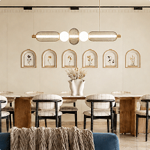
- Statement pendants over dining tables act as the room's centrepiece and pick up colors from chairs, art and tableware.
- Picture lights above art and gallery walls draw the eye to color-rich pieces without brightening the whole room.
- Fixtures in metallic or colored finishes repeat an accent shade and tie the palette together, even when switched off.
What Are the Three Layers of Light Designers Use?
Layered lighting means combining different types of light so that no single fixture does all the work. It is the main reason designer rooms look rich in color rather than flat.
Ambient Light
The overall glow of the room from chandeliers, ceiling lights and pendants. It sets the base color of the walls, so it should be soft and evenly spread.
Task Light
Focused light for reading, cooking and working, from table lamps and floor lamps. It brightens surfaces without washing out the whole room.
Accent Light
Wall lights, picture lights and uplights that highlight art, texture and feature walls. This layer makes bold and dark colors come alive.
How Do Designers Balance Color and Lighting in Each Room?
Every room has a different job, so the balance between color and light changes from space to space. Here is how designers approach the main rooms of a modern home.

Living Spaces That Feel Warm
In living rooms, designers often combine neutral walls with bold furniture and expressive lighting. A ceiling-mounted chandelier with exposed bulbs can become the focal point, while table lamps and wall lights provide supporting layers.
- Even light across seating areas keeps the room comfortable for conversation and TV time.
- Highlight artwork and textured walls with accent lights to add visual depth.
- Place a floor lamp in a dark corner so bold furniture colors still read in the evening.
- Use warm white light to make neutral walls and wooden furniture feel inviting.
Kitchens That Balance Clean Lines
Modern kitchens are often minimal in form but rich in detail. Pendant lights above kitchen islands add personality. Warm metallic finishes pair beautifully with wood cabinetry, and lighting ensures these colors feel cohesive rather than disconnected.
- Hang two or three pendants over an island, roughly 75–90 cm above the countertop.
- Add under-cabinet lighting so worktops are bright without a glaring overhead light.
- Choose 3000K–3500K light so food, wood and stone look natural.
- Repeat the cabinet hardware finish in the pendants for a pulled-together look.


Bedrooms for Calm and Comfort
In modern bedrooms, lighting is intentionally restrained. Designers avoid overly bright fixtures and instead focus on soft table lamps and wall-mounted lights. Warm light complements muted wall colors and textured fabrics, helping the room feel restful.
- Pick muted wall colors such as sage, greige, dusty pink or soft clay.
- Use bedside lamps or sconces at roughly eye level when you are sitting up in bed.
- Avoid a bright light directly above the bed — it glares when you lie down.
- Add accent lighting to niches to show off texture without disturbing the calm.
Dining Rooms That Feel Inviting
- Center a chandelier or pendant over the table, about 75–90 cm above the tabletop.
- Warm light flatters food and faces and makes deep wall colors feel intimate.
- A gallery wall with accent light brings color into the room without repainting.
Corridors and Hallways
- Space wall lights evenly so the passage has a steady rhythm of light.
- Light-colored walls bounce light and make narrow corridors feel wider.
- Up-and-down sconces add drama to darker hallway colors.
How to Balance Color and Lighting in Your Home: Step by Step
Whether you are repainting one room or planning a new home, follow these steps in order for a result that feels designer-made.
Study the Room's Natural Light
Note which way the windows face and how bright the room feels at different times of day.
Choose the Light Tone Before the Paint
Decide whether the room will have warm or neutral light, then shortlist paint colors that suit that tone.
Test Swatches Under Real Light
Look at large paint samples on different walls in daylight and under your planned bulbs at night.
Swap Cool Bulbs for Warm Ones
Replace harsh cool-white bulbs in living areas with warm-toned alternatives for an immediate change in atmosphere.
Add Table and Floor Lamps
Introduce lamps at different heights to break up harsh overhead lighting and create balanced comfort.
Install Dimmers Where You Can
Dimmers let one room shift from bright and practical in the day to soft and moody in the evening.
How Do Fixture Materials Shape Light Quality?
Designers understand that materials influence how light behaves. Glass provides diffusion, while fabric shades offer softness. Metal finishes reflect light, and matte surfaces reduce glare.
- Clear glass gives sparkle and crisp shadows; frosted or opal glass spreads a soft, even glow.
- Linen and cotton lampshades diffuse light, and the shade's color tints the glow slightly.
- Brass and gold reflect a warm sheen that lifts neutral and green palettes.
- Rattan and bamboo cast patterned shadows that add texture to plain walls.
- Matte black metal directs light downward and adds clean definition to pale rooms.
"The texture of a lampshade or the finish on a wall sconce isn't just about style — it's about how that light is distributed across your space."

The Power of Statement Lighting
A well-chosen fixture does more than provide light — it acts as a centrepiece that ties the entire room's color palette together.
Visual Weight
Large fixtures can anchor a room with high ceilings and neutral tones.
Metallic Accents
Brass and gold finishes add warmth to cool-toned modern spaces.
Texture Contrast
Frosted glass against matte metal creates interesting light play.
Scale & Proportion
A simple rule: add the room's length and width in feet — the total is a good chandelier diameter in inches.
Which Lighting Finishes Go With Which Color Palettes?
The finish of a fixture works like an accessory color. Choose one main finish per room and repeat it two or three times so it feels deliberate.
Best with warm neutrals, sage and olive greens, navy, terracotta and cream.
Best with white, grey and Scandinavian or industrial palettes for crisp contrast.
Best with cool greys, blues and monochrome schemes for a sleek modern look.
Best with blush, ivory, peach and earthy tones for a soft, warm glow.
Best with beige, olive, rust and boho or Japandi-style interiors.
The most flexible choice — works with almost any palette without competing.
What Are the Most Common Color and Lighting Mistakes?
Over-lighting a Space
Too much light washes out color and eliminates the shadows that provide depth.
Mismatched Temperatures
Mixing cool and warm bulbs in the same room can make colors look muddy or inconsistent.
Choosing Paint Under Showroom Light
Store lighting is very different from home lighting, so a shade can look completely different once it is on your wall.
Relying on One Ceiling Light
A single overhead fixture creates harsh shadows and leaves corners dull and colorless.
Ignoring Paint Sheen
High-gloss walls under bright lights create glare; matte or eggshell finishes look calmer.
Expert Advice
"The biggest mistake we see is people choosing their wall colors first without considering the lighting. Always view your paint swatches under the exact light temperature you plan to install."
"If you are unsure, start with warm white light and neutral walls. Then bring in color through cushions, art and a single statement fixture — it is far easier to change than paint."
— Whispering Homes Design TeamFrequently Asked Questions
What color temperature is best for a living room?
Warm white light between 2700K and 3000K works best for most living rooms. It makes neutral, earthy and bold wall colors look rich and inviting, and it flatters skin tones and wooden furniture. Use a slightly cooler 3500K only for reading corners or work zones.
How does lighting change the way paint colors look?
Warm light pulls out the red and yellow undertones in paint, while cool light pulls out the blue and green undertones. Bright light makes colors look lighter and flatter, and dim light makes them look deeper and moodier. This is why the same paint can look completely different in a showroom, at noon and at night.
Should all the lights in one room be the same color temperature?
Yes, keeping one color temperature per room is the safest choice. Mixing warm and cool bulbs in the same space makes wall colors look patchy and muddy. If you need brighter light for a task area, increase brightness rather than switching to a cooler tone.
Which wall colors look best under warm lighting?
Warm lighting suits beige, cream, greige, terracotta, olive, mustard, blush and deep jewel tones like emerald and burgundy. These colors glow and feel cosy under 2700K to 3000K light. Very cool blues and icy greys can look dull or slightly green under strongly warm light.
How can color and lighting make a dark room feel brighter?
Choose light, warm-neutral walls with a matte or eggshell finish so light bounces softly around the room. Add several light sources at different heights, such as a ceiling light, a floor lamp and wall lights, instead of relying on one overhead fixture. Light-colored lampshades and mirrors placed opposite windows also help spread light.
Which lighting finish works best with neutral interiors?
Brass and antique gold finishes add warmth to beige, cream and white interiors, while matte black adds crisp definition to white and grey schemes. Natural rattan and wood suit earthy, boho-style neutrals. Choose one main finish for the room and repeat it two or three times so it feels intentional.
How many light sources should a room have?
Designers usually plan at least three light sources in a room, one each for ambient, task and accent lighting. Larger living rooms often need four to six sources spread around the space. Multiple sources create balanced light, softer shadows and more natural-looking color.
Should you choose paint color or lighting first?
Designers choose paint and lighting together, but they decide the light color temperature before finalising the paint shade. Once you know whether the room will have warm or neutral light, test large paint swatches under that exact light at morning, noon and night before you commit.
Harmonizing Your Home
Modern interiors succeed when lighting and color work in harmony. Designers do not chase trends blindly; they build spaces that respond to light, support function, and reflect personality.
By understanding how lighting influences color and how color shapes mood, anyone can create a home that feels intentional, warm, and visually compelling.
Find the Fixture That Completes Your Palette
Explore chandeliers, pendants, wall lights and lamps from Whispering Homes, designed to bring warmth and character to every color scheme.
Explore the Collection