












































































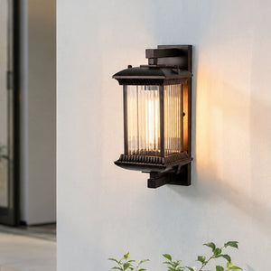

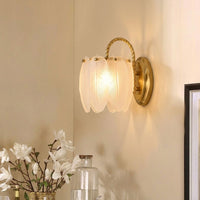










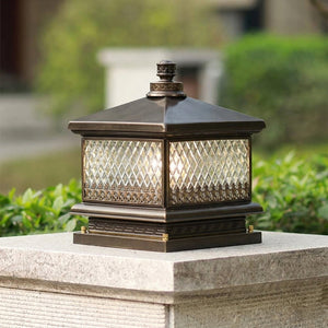
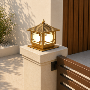
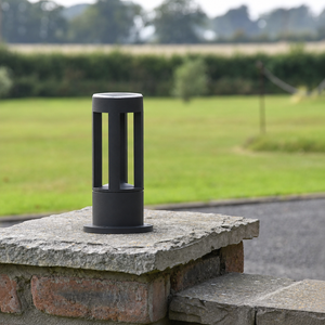

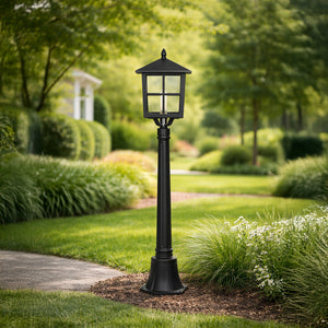



































What Are the Differences Between 3000K, 4000K, 5000K, and 6000K Color Temperatures?
Lighting does far more than illuminate a room—it shapes how colors are perceived, controls biological circadian rhythms, and defines the structural ambiance of an interior space. In luxury residential design, selecting the incorrect color temperature can dull rich brass finishes, wash out warm ceramic glazes, or turn a relaxing lounge into a sterile space.
Color temperature is measured on the Kelvin (K) scale, quantifying the visual warmth or coolness of light emitted by a bulb. Understanding the distinct characteristics of 3000K, 4000K, 5000K, and 6000K empowers homeowners, interior designers, and architects to craft layered lighting schemes tailored to every room's functional and aesthetic needs.

The Science of the Kelvin Scale & Optical Perception
The Kelvin scale for lighting is derived from thermal physics: when a theoretical "black-body radiator" is heated, it glows red, then yellow, white, and finally blue at increasing temperatures.
Lower Kelvin Ratings (2200K – 3000K) → Warm, Golden Spectrum (High Red/Orange Wavelengths)
Higher Kelvin Ratings (5000K – 6500K) → Cool, Daylight Spectrum (High Blue Wavelengths)
Key Optical Concepts for Home Design
Color Rendering Index (CRI): While Kelvin measures the color tint of light, CRI (rated 0–100) measures how accurately that light reveals the true color of objects. Always pair high CRI (90+) LED bulbs with your chosen Kelvin rating to ensure materials look rich and natural.
Photopic Vision: The human eye relies on different photoreceptor cells during the day vs. night. High Kelvin light provides maximum contrast for detailed visual work, while warm light reduces eye strain in ambient settings.
Why Color Temperature Matters in Interior Design & Daily Life
Selecting the right color temperature isn't just an aesthetic choice; it directly impacts your health, home aesthetics, and functional comfort.
1. Psychological Ambiance & Mood
Light quality triggers immediate emotional responses. Lower Kelvin ratings (warm tones) evoke feelings of safety, intimacy, and relaxation—similar to a fireplace or sunset. Higher Kelvin ratings (cool tones) stimulate mental alertness and activity, mimicking bright midday daylight.
2. Circadian Health & Sleep Quality
Your eyes contain specialized photoreceptors that react to light spectrums. Elevated blue-light frequencies present in 5000K–6000K suppress melatonin production, keeping you awake and energized.
Using high-Kelvin lighting in bedrooms or living areas during the evening can disrupt your natural sleep cycles. Conversely, 2700K–3000K light promotes evening relaxation and supports natural circadian rest patterns.
3. Material & Decor Representation
Every finish in your home absorbs and reflects light differently depending on the Kelvin rating:
- Warm Finishes (Antique Brass, Terracotta, Walnut): Glow richly under 3000K, but appear dull, muddy, or gray under 5000K+.
- Cool Finishes (Statuary Marble, Polished Chrome, Concrete): Look crisp and vibrant under 4000K, but can look aged or unwashed under warm 2700K light.
3000K, 4000K, 5000K, and 6000K: Technical & Practical Comparison
| Feature | 3000K (Warm White) | 4000K (Neutral / Cool White) | 5000K (Full Daylight) | 6000K (Commercial Daylight) |
|---|---|---|---|---|
| Visual Tone | Soft, golden-amber hue | Clean, crisp, neutral white | Vibrant, daylight-balanced white | Intense, stark white with a blue cast |
| Wavelength Spectrum | Heavy in Red/Yellow | Balanced Red, Green, Blue | Heavy in Blue Wavelengths | Dominant Blue Wavelengths |
| Human Biological Response | Relaxing, comforting, calming | Focused, alert, non-fatiguing | High alertness, suppresses melatonin | High visual tension, task-focused |
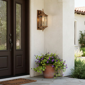
| Primary Placement | Living rooms, bedrooms, dining zones | Kitchens, vanities, home offices | Garages, craft studios, utility rooms | Security perimeters, commercial displays |
| Material Synergy | Antique brass, alabaster, terracotta | Chrome, white marble, fluted glass | Polished concrete, dark slate | Utilitarian metalwork, security enclosures |
Detailed Breakdown: Selecting the Right Color Temperature
1. 3000K: Warm White (Cozy, Inviting & Refined)
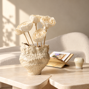
3000K Warm White represents the perfect balance for luxury residential interiors. It sits at the ideal sweet spot of warm illumination—offering a subtle golden-amber undertone without the heavy orange or yellowish tint characteristic of vintage 2200K filament bulbs.
- Aesthetic Impression: Sophisticated, warm, and relaxing. It softens hard edges without obscuring architectural details.
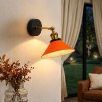
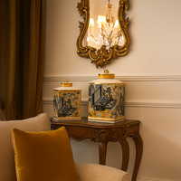
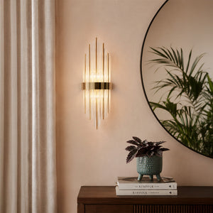
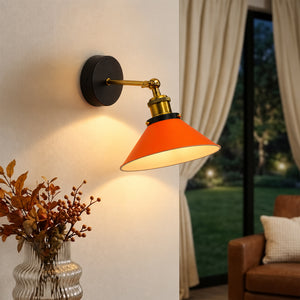
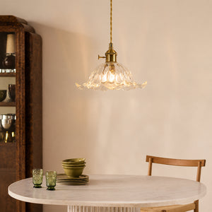
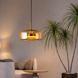
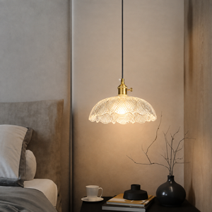
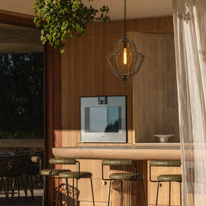
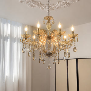
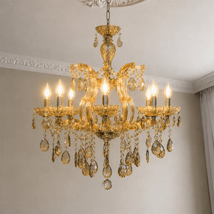
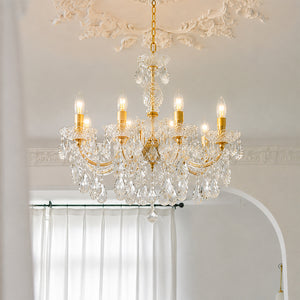
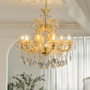
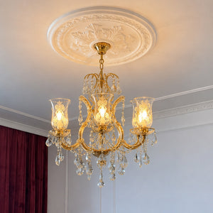
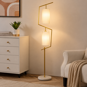
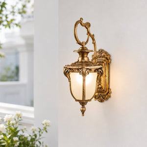
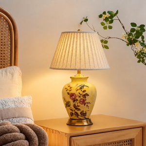
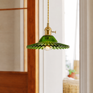
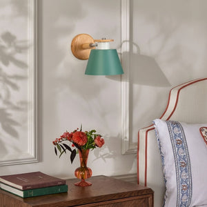
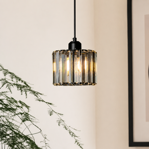
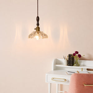
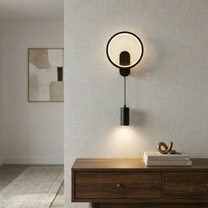
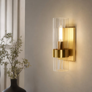
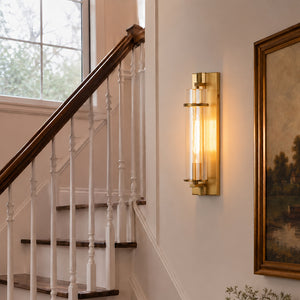
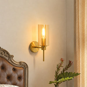
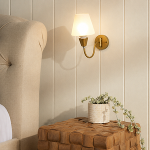
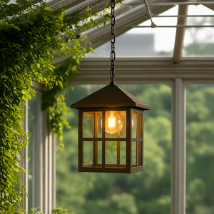
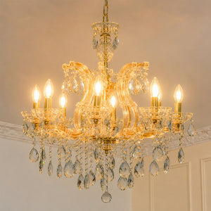
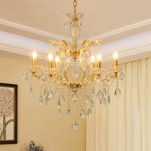
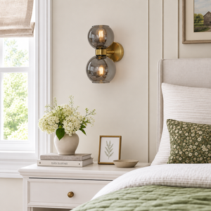
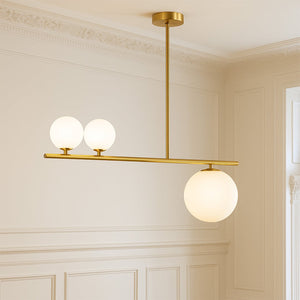
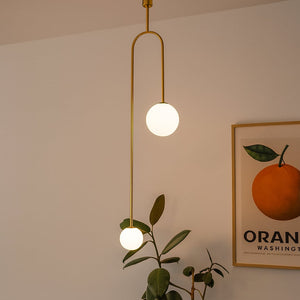
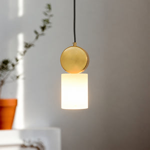
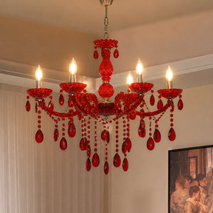
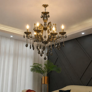
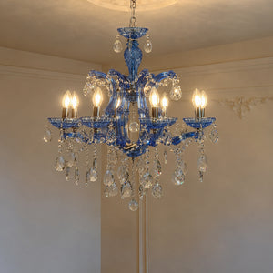
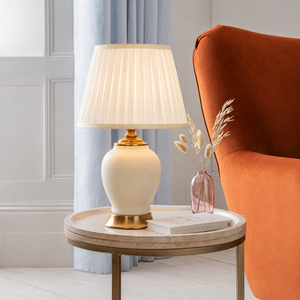
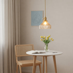
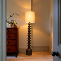
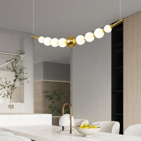
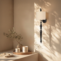
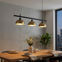
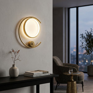
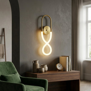
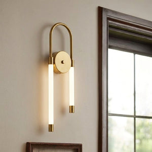
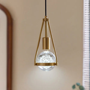
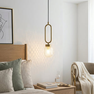
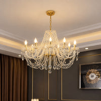
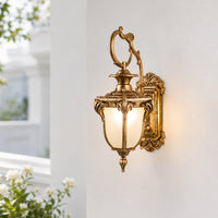
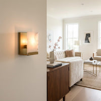
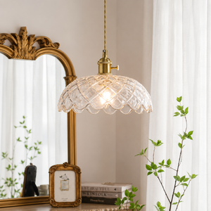
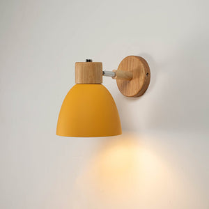
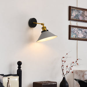
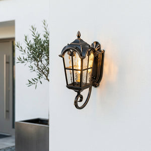
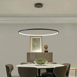
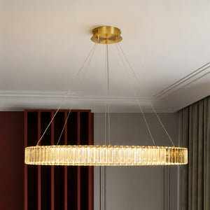
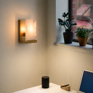
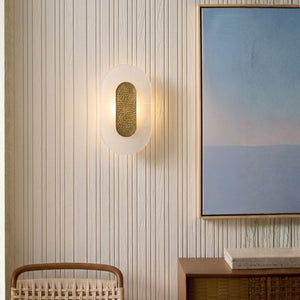
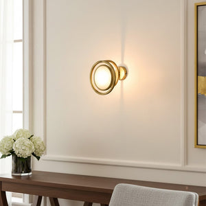
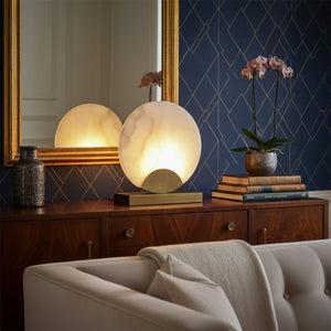
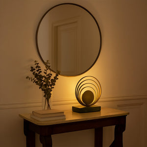
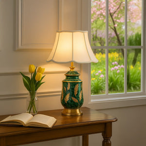
- Ideal Fixture Pairings: Crystal chandeliers, antique brass wall sconces, ribbed ceramic table lamps, and amber or frosted glass pendants.
- Material Interaction: Enhances warm timber grains (walnut, teak), raw clay, linen lamp shades, and warm metallics like brushed brass and gold leaf.
- Avoid In: High-precision task areas like kitchen prep islands or detailed art restoration desks.
2. 4000K: Neutral / Cool White (Crisp, Balanced & Functional)
4000K Cool or Neutral White produces a clean, crisp, neutral white beam with zero noticeable yellow or blue tint. It accurately mimics bright, natural daylight as seen during mid-morning hours.
- Aesthetic Impression: Modern, clean, and highly organized. It sharpens room boundaries and keeps colors true to life.
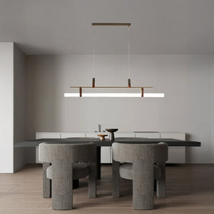
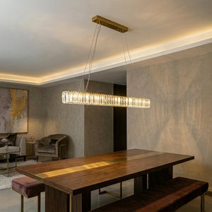
- Ideal Fixture Pairings: Linear LED ceiling fixtures, under-cabinet kitchen task bars, adjustable desk lamps, and bathroom vanity mirror sconces.
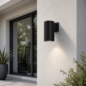
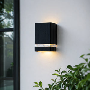
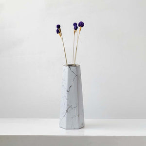
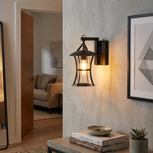
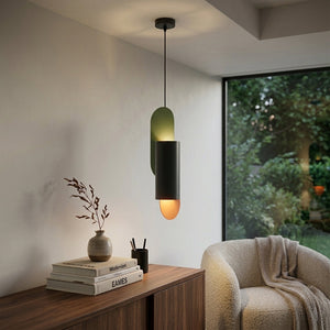
- Material Interaction: Works with cool-toned finishes such as Italian statuary marble, polished chrome, matte black fixtures, stainless steel, and terrazzo.
- Avoid In: Bedrooms and primary lounge zones where relaxing ambiance takes priority over functional visibility.
3. 5000K: Full Daylight (High-Contrast & Detail-Oriented)
5000K Full Daylight provides intense, vibrant, high-contrast illumination that closely replicates direct overhead midday sunlight. It features a strong, noticeable blue undertone designed specifically for high visual accuracy.
- Aesthetic Impression: Energetic, intense, and clinical. Colors appear vibrant, but warm interior elements can look washed out.
- Ideal Placement: Residential basements, attached multi-car garages, sewing/crafting studios, and laundry utility rooms.
- Material Interaction: Best paired with utilitarian materials like industrial metals, painted drywall, and epoxy resin flooring.
- Avoid In: Any primary living space, dining area, or bedroom. It disrupts circadian rest patterns and creates an uncomfortable visual environment.
4. 6000K: Commercial Daylight (Icy & High-Visibility)
6000K Commercial Daylight emits an extremely intense, bright white beam with a pronounced icy blue tint. It is engineered specifically for commercial performance and high-visibility outdoor safety rather than indoor residential comfort.
- Aesthetic Impression: Extremely stark, high-glare, and clinical.
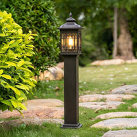
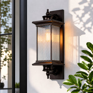
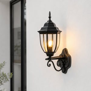
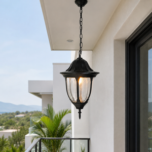
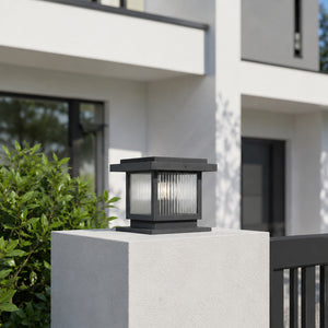
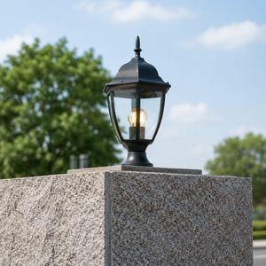
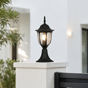
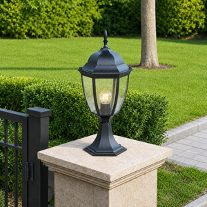
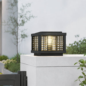
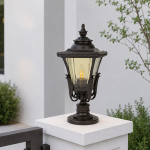
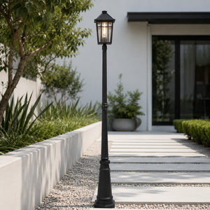
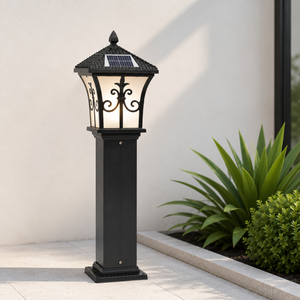
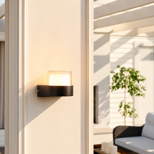
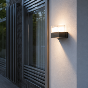
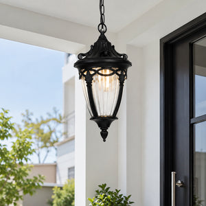
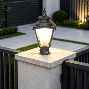
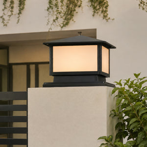
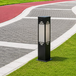
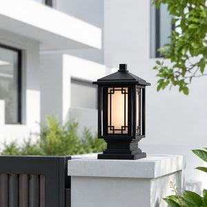
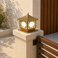
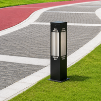
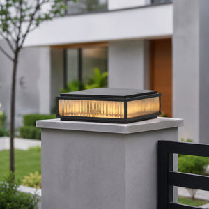
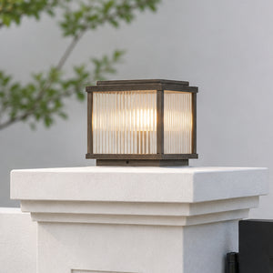
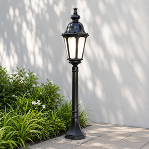
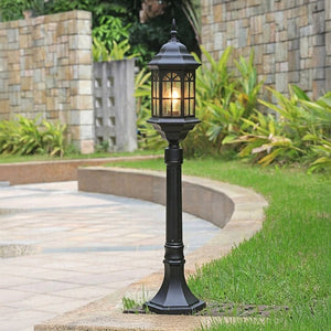
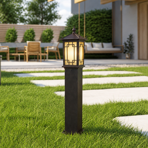
- Ideal Placement: External boundary gate pillars, high-security floodlights, commercial warehouse displays, and outdoor bollards.
- Material Interaction: Works strictly with functional exterior stonework, security fencing, and outdoor structural metals.
- Avoid In: All indoor residential rooms.
Room-by-Room Color Temperature Blueprint
BEDROOM / LIVING ROOM: 2700K – 3000K — Warm, Golden, Relaxing
KITCHEN & VANITY: 3000K – 4000K — Neutral, High-CRI, Clear
GARAGE & UTILITY: 5000K – 6000K — High-Contrast, Alert
What Color Temperature Is Best for Living Rooms and Dining Areas?
- Recommended Kelvin: 2700K – 3000K
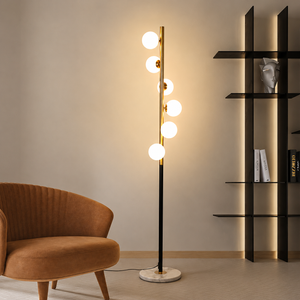
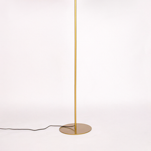
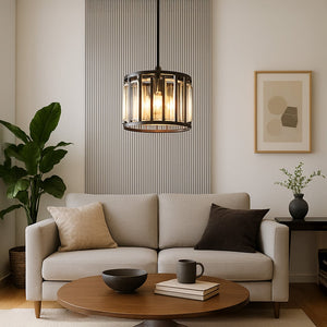
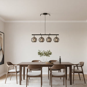
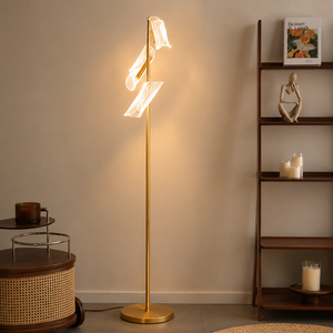
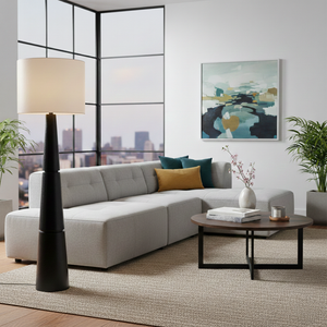
- Strategy: Layer central ambient light (such as a 3000K chandelier) with warm 2700K floor lamps and low-level wall washers to create dynamic depth during evening entertaining.
What Color Temperature Is Best for Kitchens and Breakfast Counters?
- Recommended Kelvin: 3000K (Ambient) + 4000K (Task)
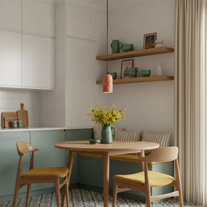
- Strategy: Use 3000K for primary ceiling pendants over island seating to keep the space inviting. Install concealed 4000K under-cabinet LED strips over countertops to provide shadow-free illumination for food preparation.
What Color Temperature Is Best for Master Bedrooms?
- Recommended Kelvin: 2700K – 3000K
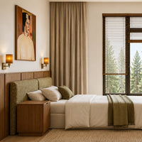
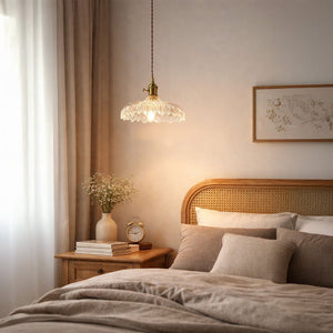
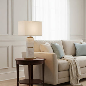
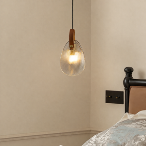
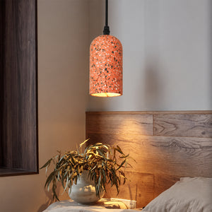
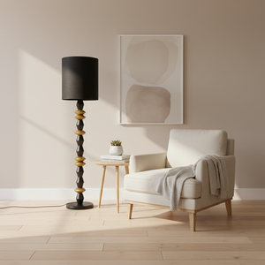
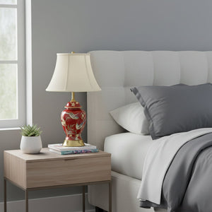
- Strategy: Keep color temperatures strictly at or below 3000K to prevent blue-light circadian disruption. Utilize warm bedside table lamps with soft fabric or frosted glass shades.
What Color Temperature Is Best for Bathrooms and Vanity Mirrors?
- Recommended Kelvin: 3000K – 4000K
- Strategy: Flank vanity mirrors with vertical sconces rated at 3500K–4000K with a minimum 90 CRI rating to ensure accurate skin tone rendering for grooming and makeup.
Common Color Temperature Mistakes to Avoid
- Mixing Kelvins in the Same Direct View: Avoid installing a 3000K ceiling fixture right next to a 5000K recessed spotlight in an open-plan room. The contrast will make the 3000K light look dirty/yellow and the 5000K light look harsh/blue.
- Ignoring Material Finishes: Pairing a 5000K daylight bulb with warm antique brass or terracotta decor neutralizes their natural warmth and makes high-end materials look flat.
- Over-Relying on Non-Dimmable Bulbs: Always pair 3000K and 4000K light sources with compatible LED dimmers to adjust illumination levels from daytime activity to evening relaxation.