


Color is more than a design choice. It is emotion, mood, and personality translated into space. The shades you surround yourself with influence how a room feels - calm or energetic, warm or refreshing, bold or understated. Choosing decor by color is one of the most powerful ways to create a home that feels cohesive, intentional, and uniquely yours.
At Whispering Homes, we understand that color sets the foundation for every interior. Whether you are building a neutral sanctuary, adding dramatic contrast, or layering warm earthy tones, shopping by color simplifies the process. Instead of searching endlessly, you can explore lighting and decor that naturally align with your existing palette and design vision.
Why Shopping Decor by Color Makes Styling Easier
Designing a well balanced space often begins with a defined color direction. When decor pieces share tonal harmony, rooms feel thoughtfully curated instead of randomly assembled.
Shopping by color helps you:
- Maintain visual consistency across different rooms
- Coordinate decor with furniture and wall finishes
- Avoid mismatched accent pieces
- Create smooth transitions between spaces
- Build a clear and confident design plan
Rather than starting from scratch, color gives you a clear path forward.
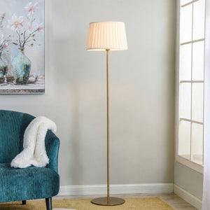
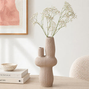
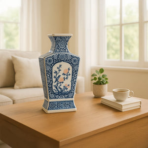
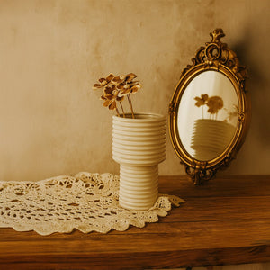
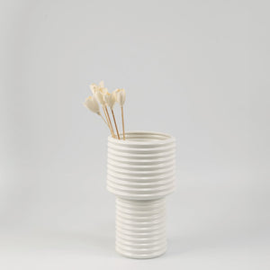
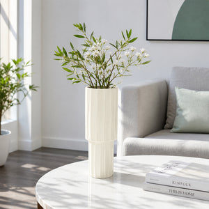
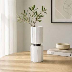
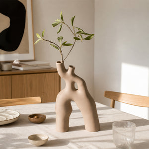
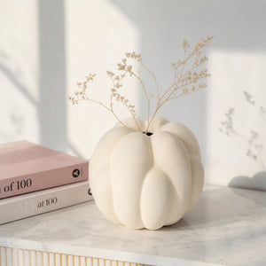
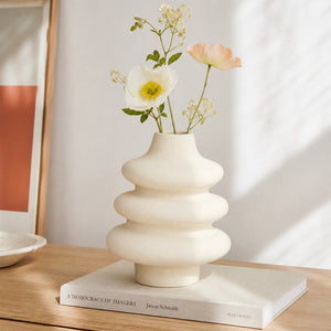
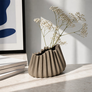
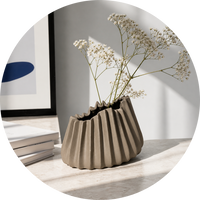
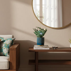
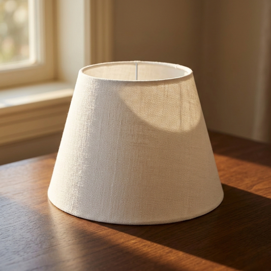
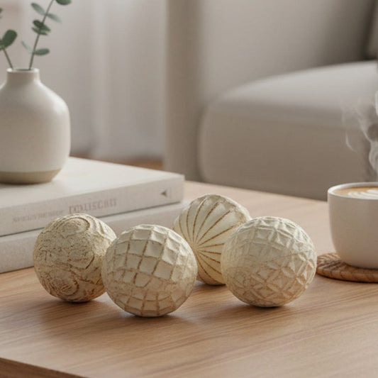
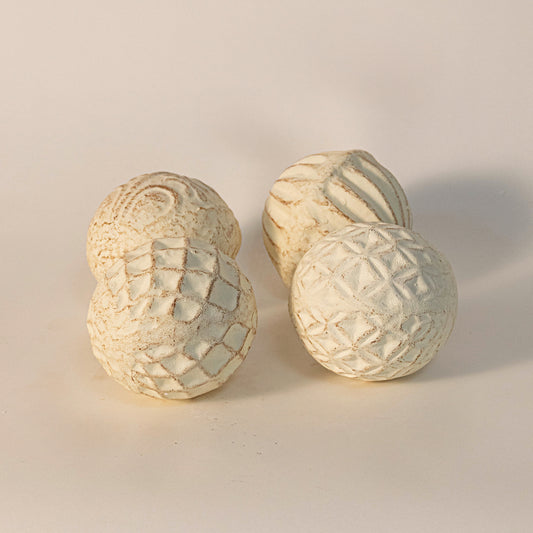
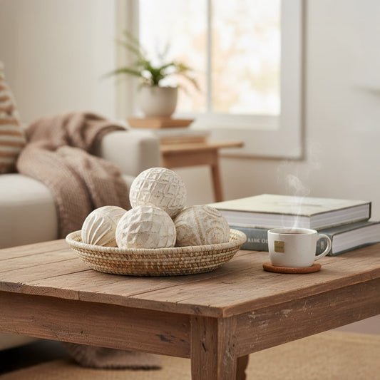
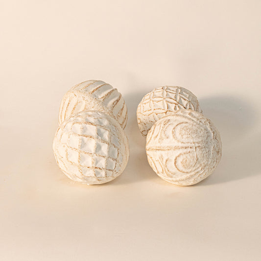
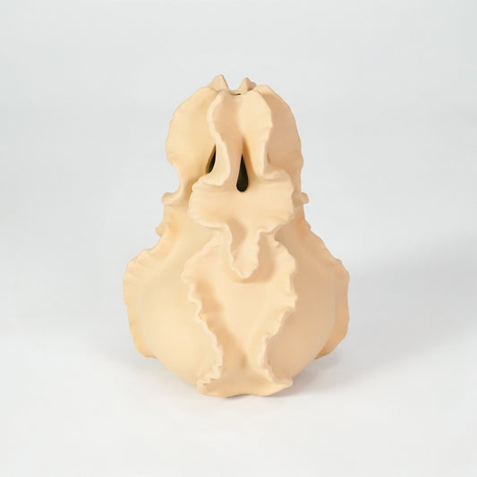
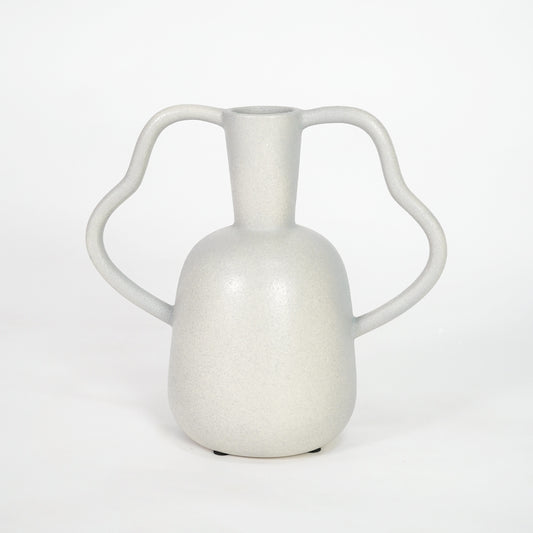
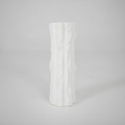
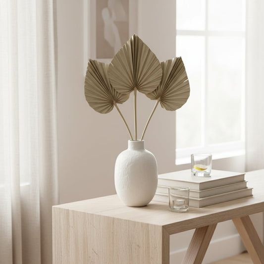
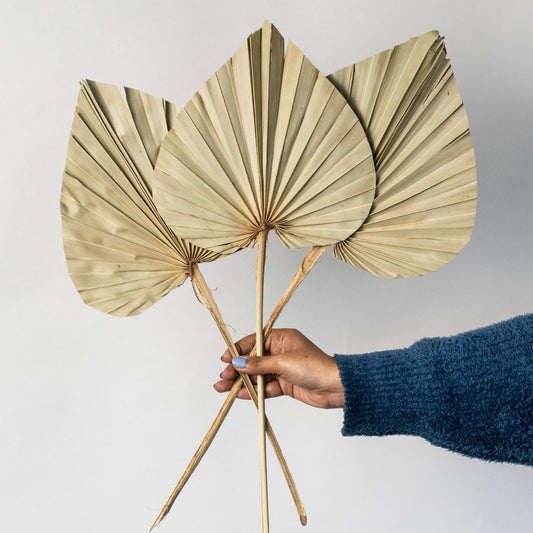
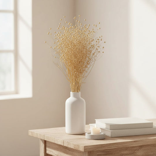
The Power of Neutral Tones
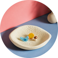
Neutral shades are timeless for a reason. They offer flexibility, softness, and understated elegance. When you choose neutral decor, you create a calm canvas that allows texture and form to shine.
Common neutral tones include:
- Beige and sand
- Soft white and ivory
- Warm grey
- Taupe and muted cream
Neutral decor works beautifully in living rooms, bedrooms, and open plan spaces where harmony and balance matter most. It also allows you to refresh the room easily with seasonal accents.
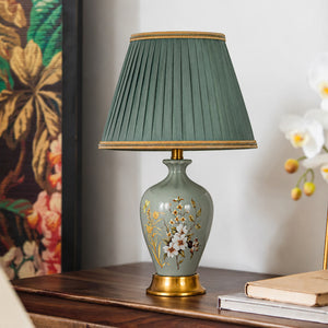
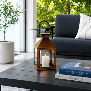
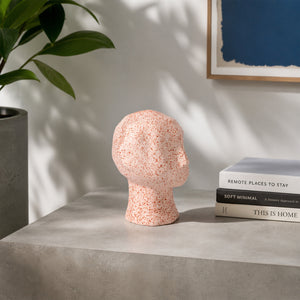
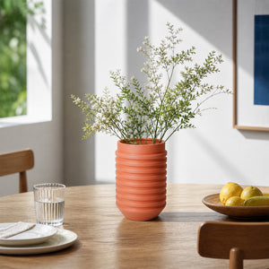
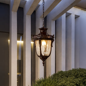
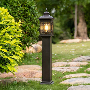
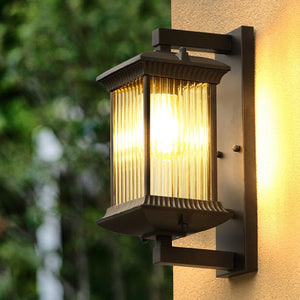
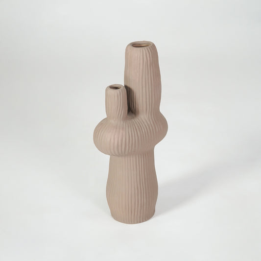
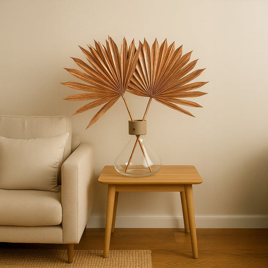
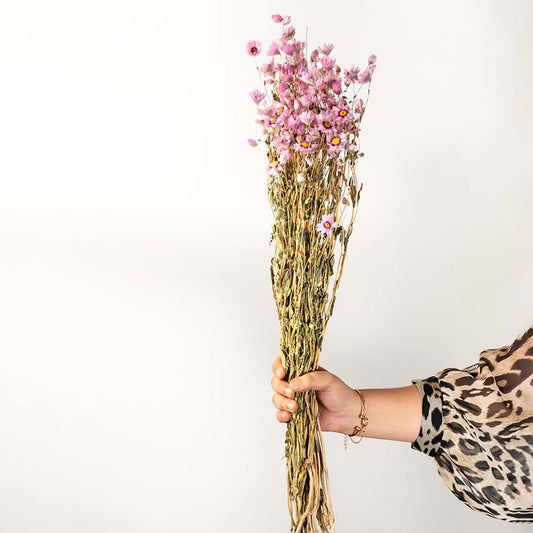
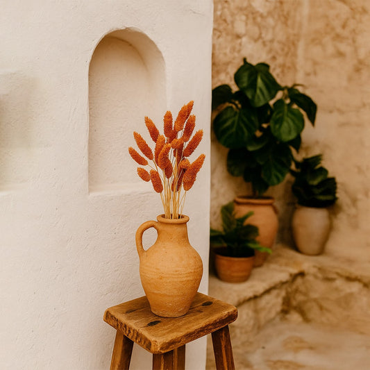
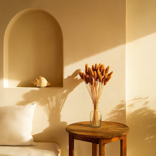
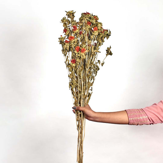
Warm Earthy Shades That Add Depth
Earth inspired colors bring warmth and grounded character into interiors. These tones feel inviting and emotionally comforting, especially in modern homes seeking a cozy atmosphere.
You may find:
- Terracotta inspired hues
- Rust and clay tones
- Deep browns
- Muted olive shades
Earthy decor pairs naturally with wood finishes, textured fabrics, and soft lighting. It is ideal for layered interiors that value warmth over stark minimalism.
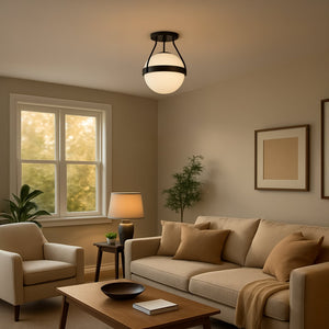
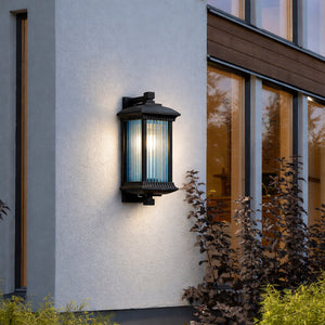
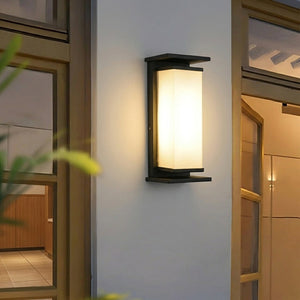
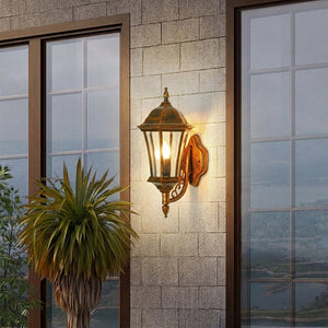
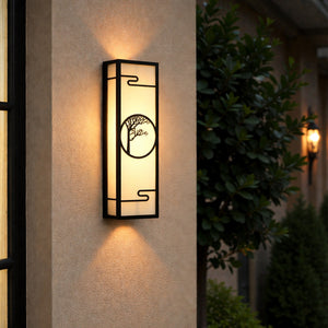
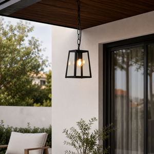
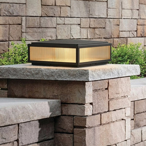
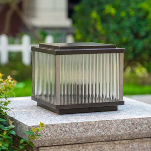
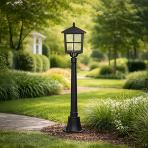
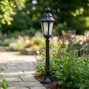
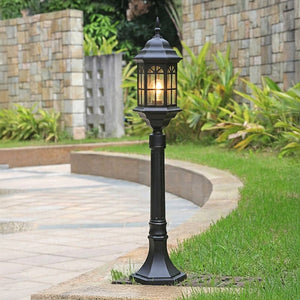
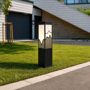
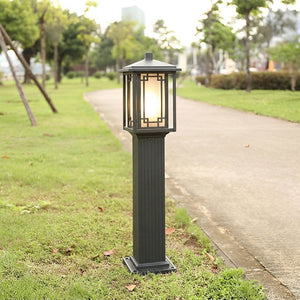
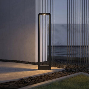
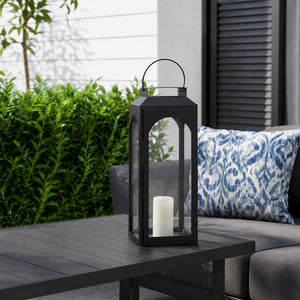
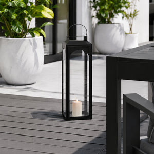
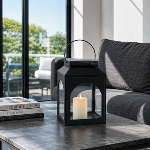
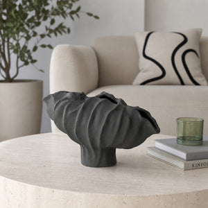
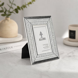
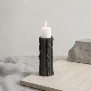
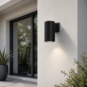
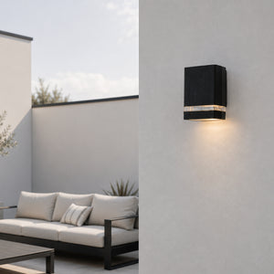
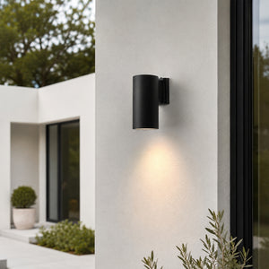
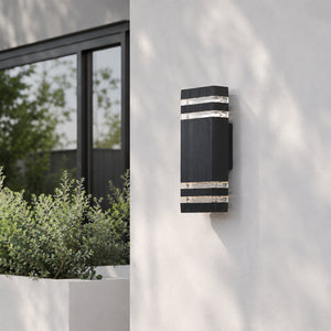
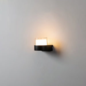
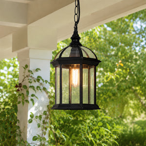
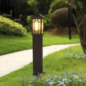
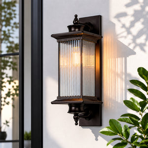
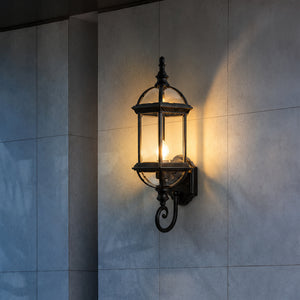
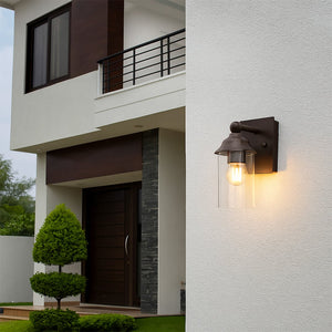
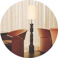
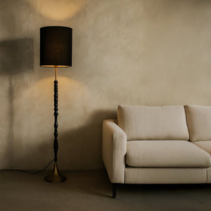
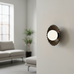
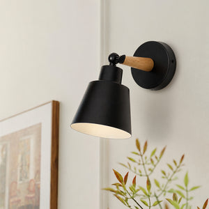
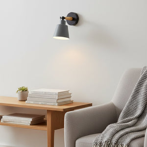
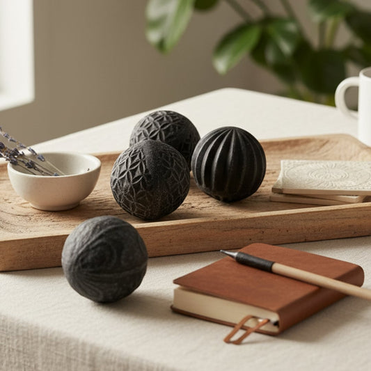
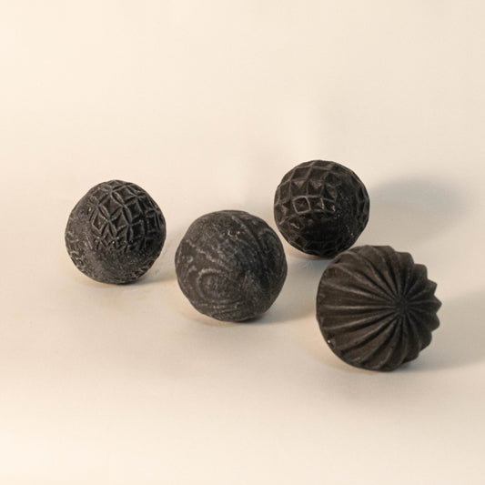
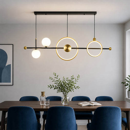
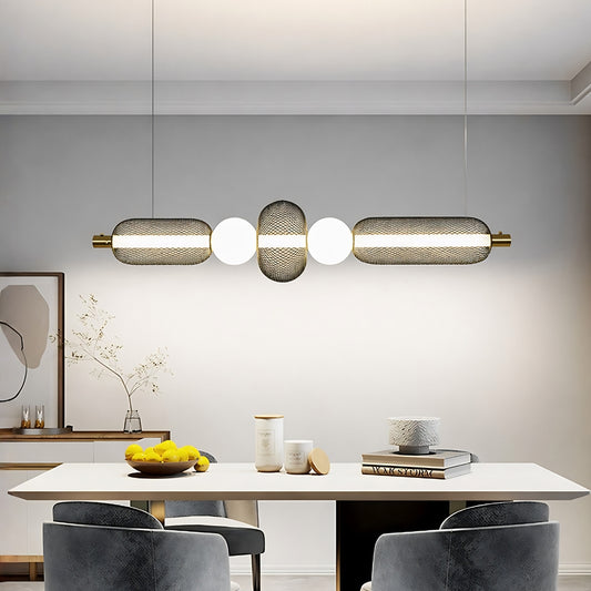
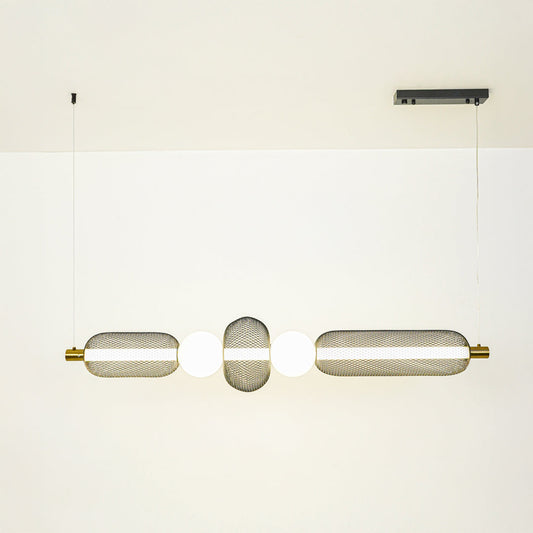
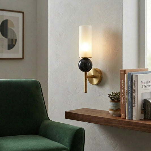
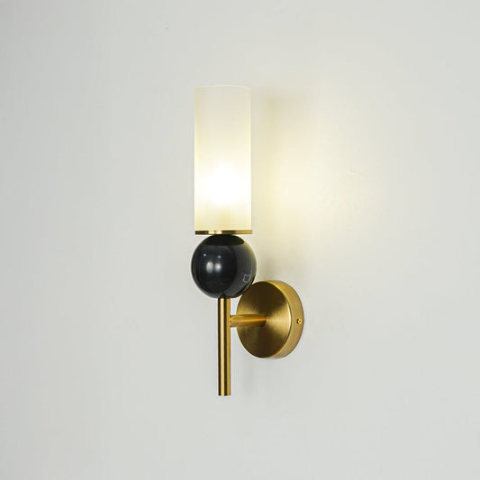
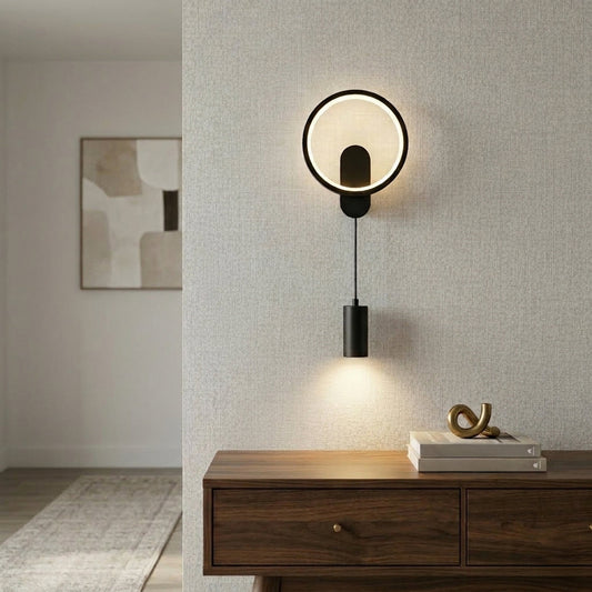
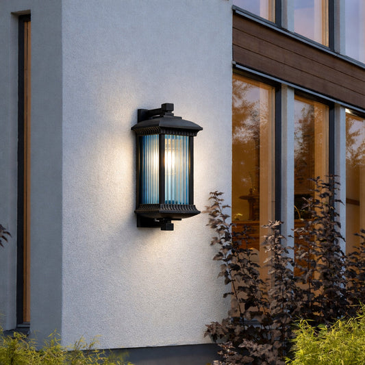
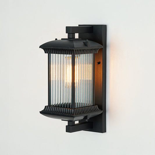
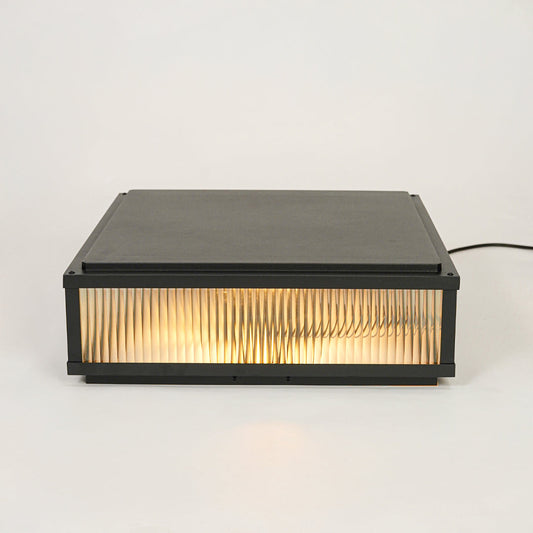
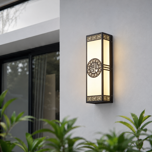
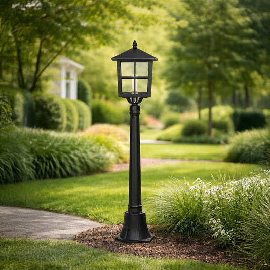
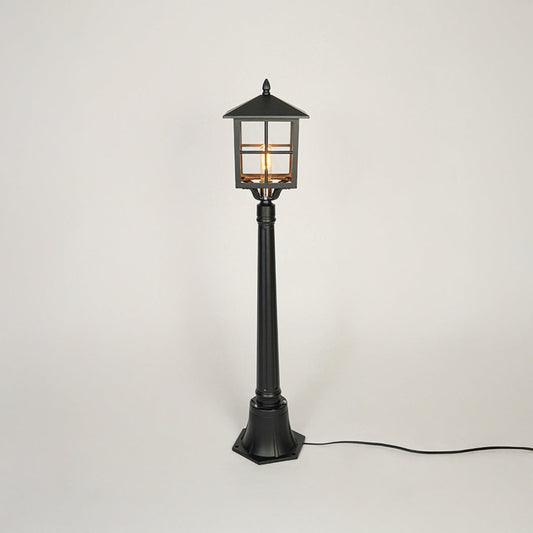
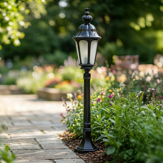
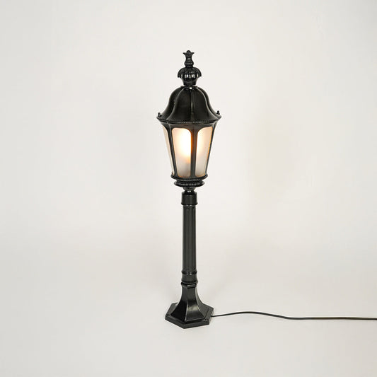
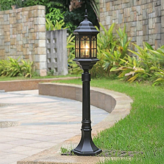
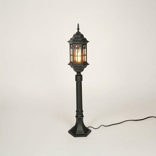
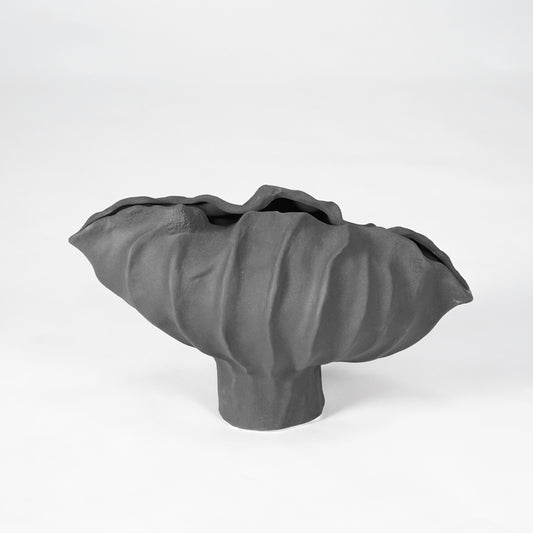
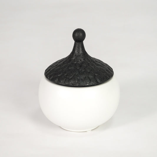
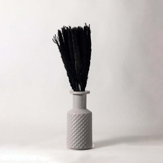
Black Decor for Bold Contrast
Black is confident and timeless. When used thoughtfully, it creates striking contrast and architectural depth.
Black decor can:
- Anchor light colored rooms
- Add definition to neutral palettes
- Create modern sophistication
- Highlight surrounding textures
In lighting fixtures and decorative accents, black introduces strength without overwhelming the room.
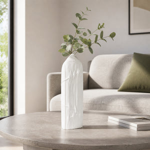
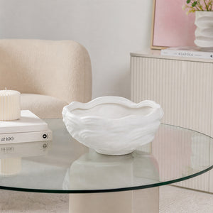
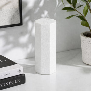
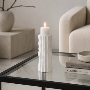
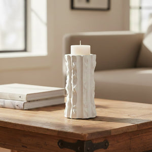
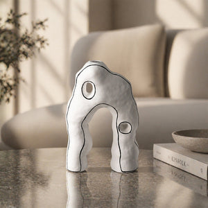
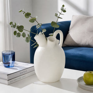
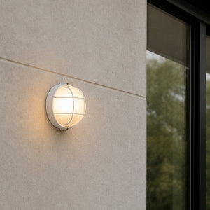
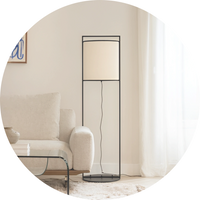
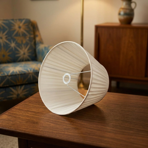
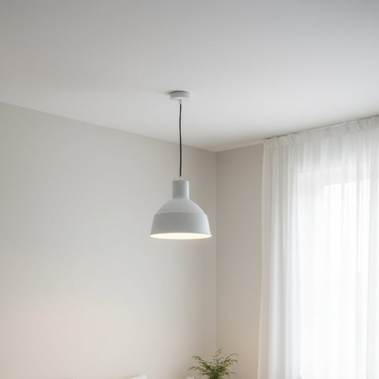
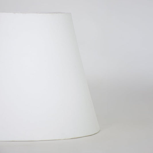
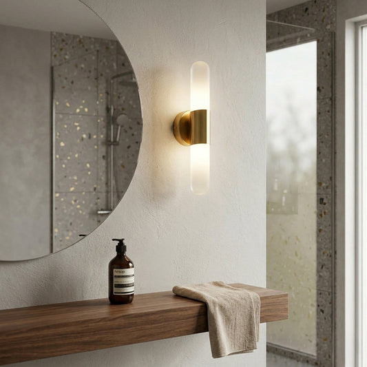
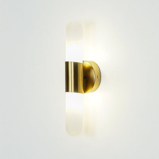
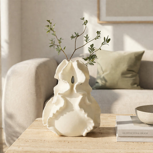
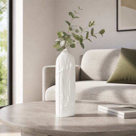
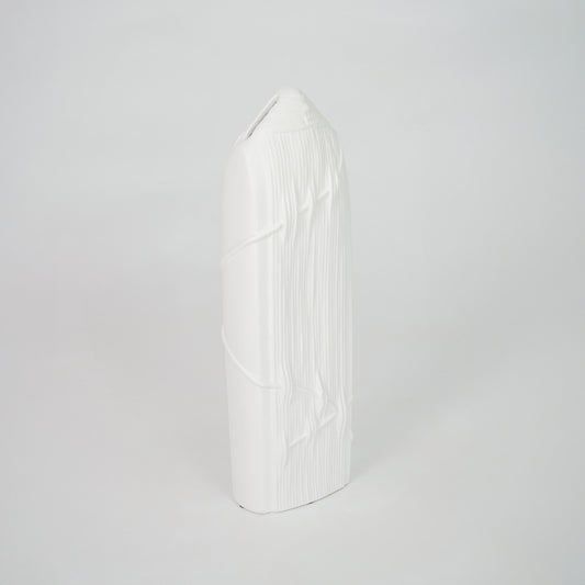
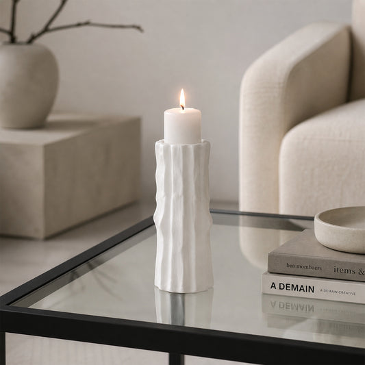
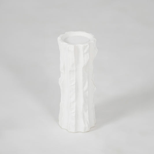
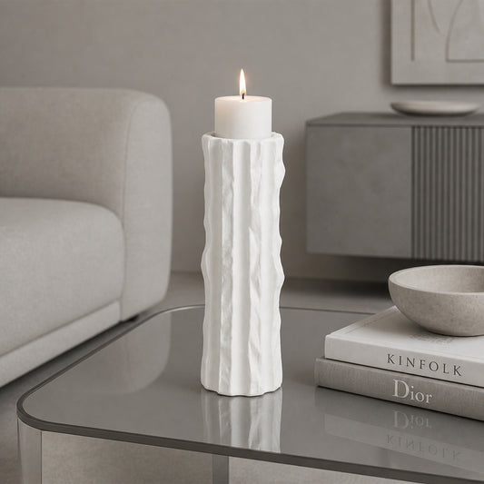
White Decor for Airy Elegance
White decor enhances light and creates a sense of openness. It works especially well in smaller spaces where brightness matters.
Benefits of white decor include:
- Reflecting natural light
- Creating visual clarity
- Supporting minimalist styling
- Acting as a base for layering
When paired with subtle textures, white never feels flat or sterile.
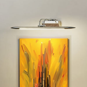
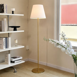
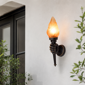
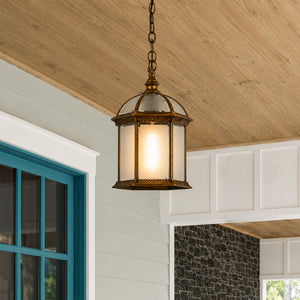
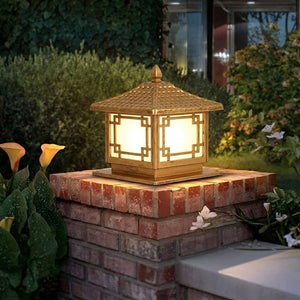
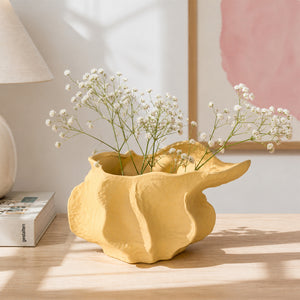
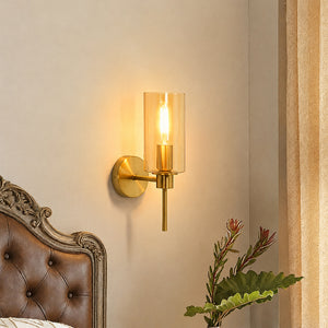
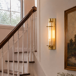
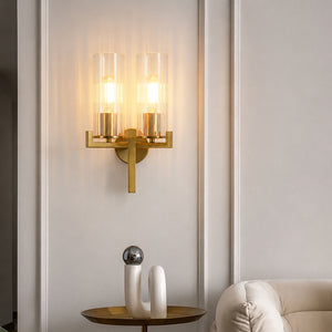
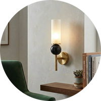
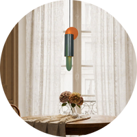
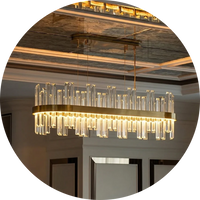
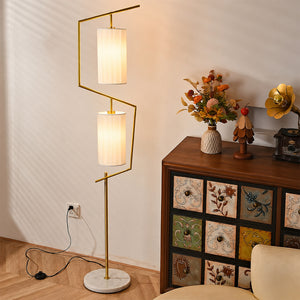
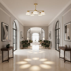
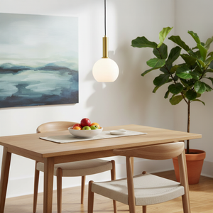
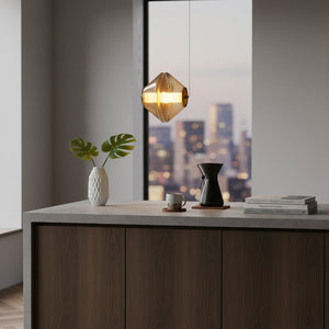
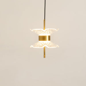
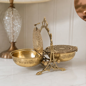
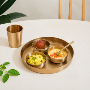
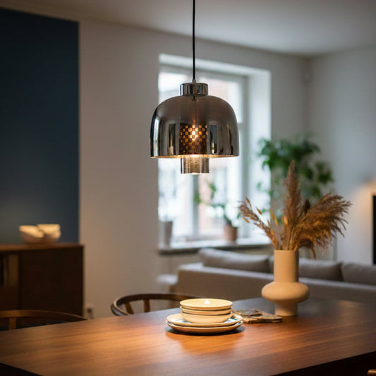
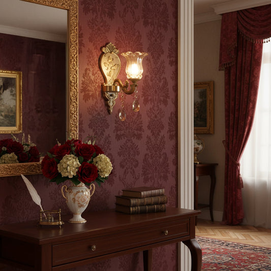
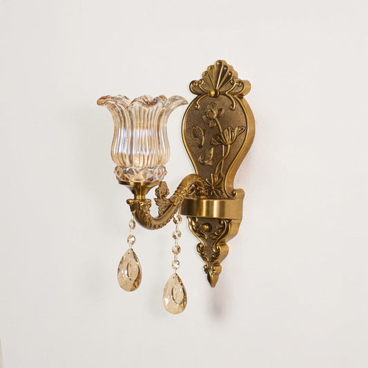
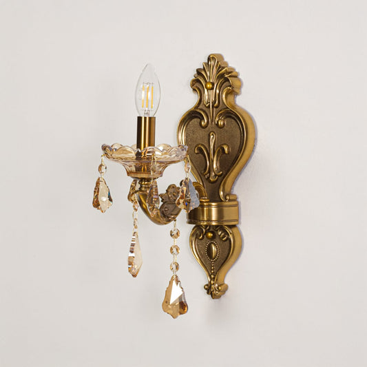
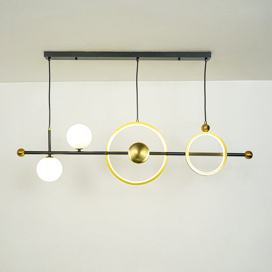
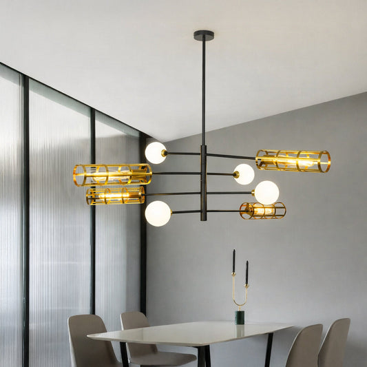
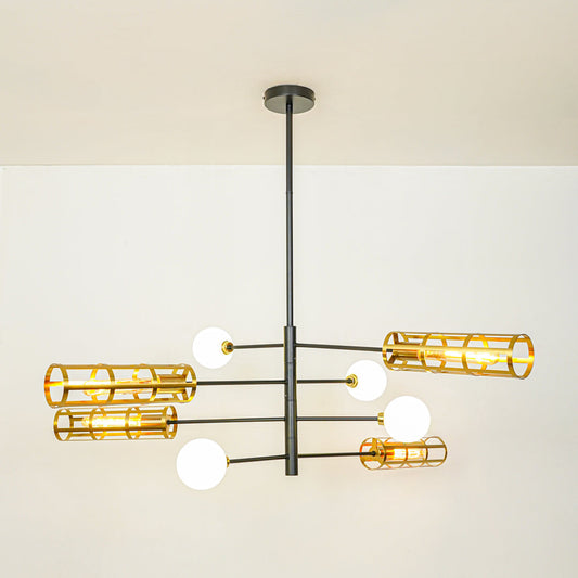
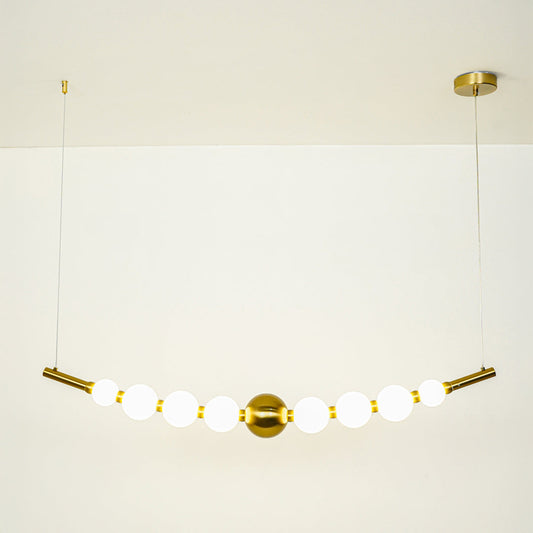
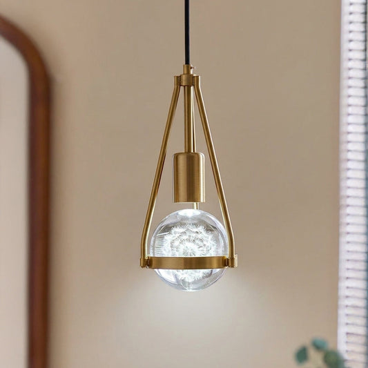
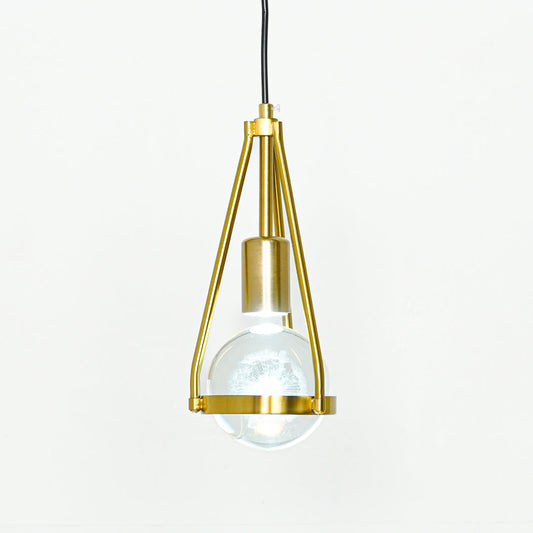
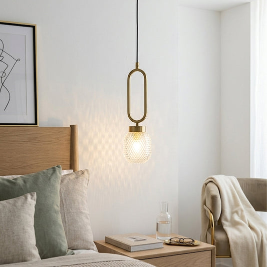
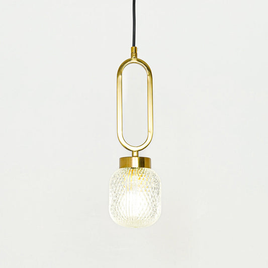
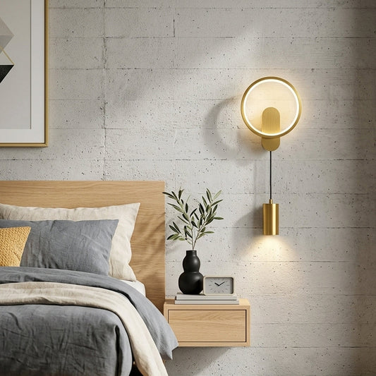
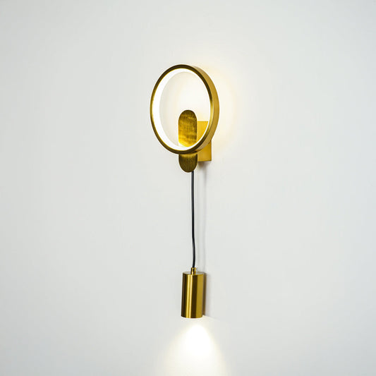
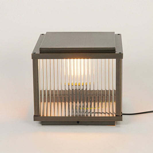
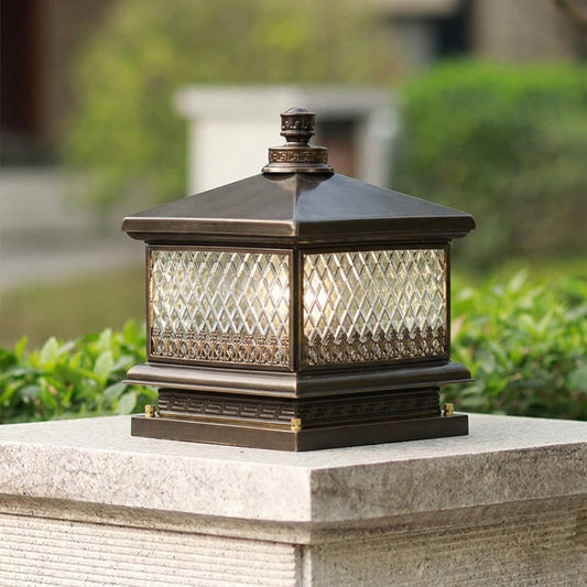
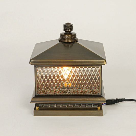
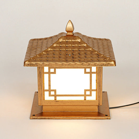
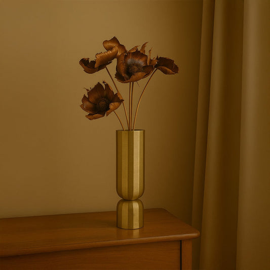
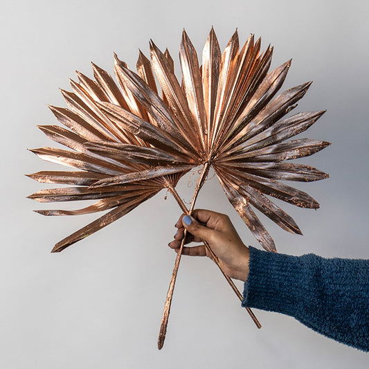
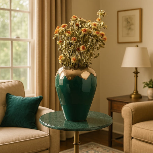
Gold and Metallic Tones for Refined Luxury
Metallic accents elevate interiors instantly. Gold finishes, brushed metals, and subtle shimmer add dimension and quiet glamour.
These tones are perfect for:
- Statement lighting
- Accent decor pieces
- Highlighting focal areas
- Balancing neutral settings
Used sparingly, metallic elements bring elegance without overpowering the design.
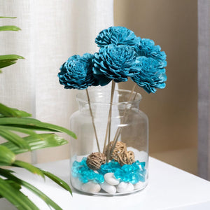
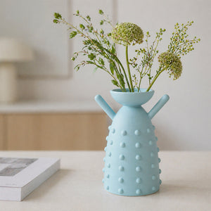
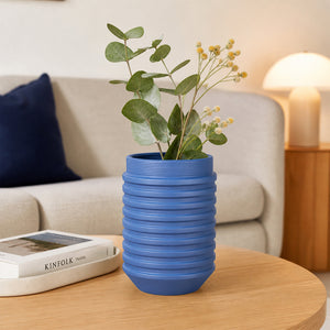
Blue Tones for Calm and Sophistication
Blue evokes tranquility and balance. From deep navy to soft powder shades, blue decor adapts beautifully to different interior moods.
Blue works well in:
- Bedrooms for a restful feel
- Living spaces with coastal influence
- Modern interiors seeking subtle color
It pairs effortlessly with whites, greys, and warm wood finishes.
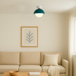
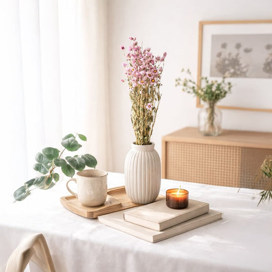
Green Shades Inspired by Nature
Green introduces freshness and organic harmony. It reflects nature and promotes a relaxed atmosphere.
Green decor often complements:
- Neutral interiors
- Botanical inspired styling
- Natural materials like wood and ceramic
Soft sage feels calming, while deeper greens add richness and depth.
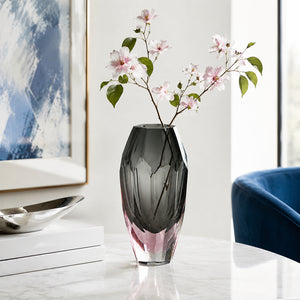
Grey for Contemporary Balance
Grey is versatile and modern. It bridges the gap between warm and cool palettes, making it easy to integrate into many styles.
Grey decor offers:
- Subtle sophistication
- Easy pairing with bold accents
- Compatibility with minimalist interiors
- A refined alternative to stark white
From light ash tones to deeper charcoal shades, grey remains effortlessly adaptable.
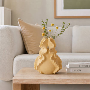
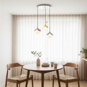
Multicolor Accents for Creative Expression
For those who enjoy vibrant interiors, multicolor decor pieces add personality and movement.
These pieces:
- Act as conversation starters
- Break monotony in neutral spaces
- Reflect artistic individuality
- Bring energy into structured rooms
When styled carefully, multicolor decor enhances rather than overwhelms.
How to Choose the Right Color for Your Space
Selecting the right decor color depends on your room's function, lighting, and overall mood.
Ask yourself:
- Do I want the room to feel calm or energetic?
- Is there enough natural light to support darker tones?
- Do I prefer contrast or seamless blending?
- What existing furniture colors need coordination?
You can also layer tones within the same color family for depth without visual chaos.
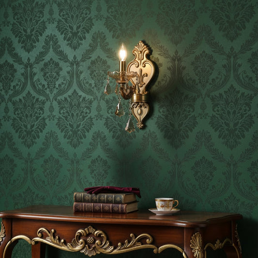
Coordinating Lighting with Color
Lighting plays a crucial role in how color appears. Warm lighting enhances earthy tones and gold finishes. Cool lighting sharpens whites and greys.
When shopping by color, consider:
- The temperature of your bulbs
- Wall paint undertones
- Surface finishes nearby
- Natural daylight exposure
Balanced lighting ensures your chosen decor color appears exactly as intended.
Creating Flow Between Rooms
Color continuity strengthens overall home design. Even if each room has a unique identity, shared tonal elements create flow.
Ways to maintain continuity:
- Repeat one accent color across spaces
- Keep metallic finishes consistent
- Balance bold colors with neutral transitions
- Use similar undertones throughout
Shopping by color makes this coordination easier and more intentional.
The Emotional Impact of Color in Home Design
Color influences mood more than we often realize.
For example:
- Warm tones encourage comfort and connection
- Cool tones promote calm and focus
- Dark tones create drama and depth
- Light tones enhance openness and clarity
Understanding this emotional impact helps you design spaces aligned with your lifestyle.
Why Color Led Shopping Saves Time
Without a defined color direction, decor selection can become overwhelming. Filtering by color simplifies the decision making process.
Advantages include:
- Faster product discovery
- Reduced design confusion
- Stronger room identity
- Improved styling confidence
It allows you to focus on what truly complements your home.
Frequently Asked Questions
Is shopping by color suitable for small spaces?
Yes. Choosing a defined palette often makes smaller rooms feel more cohesive.
Can I mix multiple colors in one room?
Absolutely. Balance is key. Choose one dominant tone and layer supporting shades.
Do darker colors make rooms feel smaller?
Not necessarily. With proper lighting and contrast, darker tones add depth rather than shrink space.
Are neutral colors boring?
No. Texture and material variation prevent neutral interiors from feeling flat.
Should lighting match decor color?
Lighting should complement and enhance your chosen palette.
Can I refresh my room seasonally through color?
Yes. Accent decor makes it easy to adjust mood without major changes.
What is the safest color to start with?
Neutral tones provide flexibility and easy coordination.
Are metallic tones considered colors?
Yes. They act as reflective accents within a palette.
Does color impact resale value?
Balanced and timeless palettes often appeal to broader audiences.
How do I test if a color works?
Start with smaller decor pieces before committing to larger investments.
Discover Your Perfect Palette
Shopping by color empowers you to design with clarity and confidence. Whether you gravitate toward warm earth tones, calming blues, bold contrasts, or soft neutrals, your chosen palette becomes the language of your home.
At Whispering Homes, our Shop By Color collection helps you find decor and lighting that align naturally with your vision. Instead of guessing what works together, you can explore coordinated pieces that build harmony effortlessly.
Because when color feels right, everything else falls into place.
- Choosing a selection results in a full page refresh.
- Opens in a new window.